“Petco is a health and wellness company for pets and pet owners.”- Petco
Petco is a mobile app that helps pets and pet owners have their needs and wants met online. It has recently updated its user experience design concepts for its users on both of these platforms, web and mobile.
My role as the Project Planning Lead for this project was to plan and lead my teammates throughout the project, support when needed, and have daily meetings to keep up with the process of the final product, which took 2 weeks to complete.

To back up Petco’s problem with data based research, I and my teammates conducted user interviews.
User Research
My team conducted interviews and surveys with pet owners nationally since Petco is an app that is used by millions around the US. This process helped us see certain shared pain points and frustrations as well as users’ goals when having their vet services done.

9 out of the 12 people want a variety of appointment options
6 specifically asking about Telehealth appointments
9 people wanted to ship their pet's prescriptions to their house
6 stated that the cost of veterinarian services was a major obstacle to booking an appointment.
User Pain Points & Frustrations
Why I chose to participate in this project?
Petco was a personal project to me because as a pet lover, pet sitter and private animal rights advocator, most importantly as a pet mother I care about animals.
Review from My Pet Care Services:
“Elif is an absolute gem!! She recently took care of our cat while we were away. From the initial meeting, I felt very reassured that she was responsible, attentive, and very kind. She made us feel like our furry baby was in great, loving hands.” - A.

Review from My Pet Care Services:
“Elif has watched Doug multiple times now and I’ve never felt as relieved, reassured, or worry-free when she is with my dog as with other pet sitters.”- G.

Our User Centered Research Process
In this study, my group members and I concentrated on mobile app users. Our mission was to first determine certain needs and wants of the users by solely relying on user-centered research. By doing so, we were able to document the emerging problem statement as well as possible solutions. Our research included';
Screener Surveys, user interviews, task analysis, affinity mapping, contextual inquiries and analysis, problem statements and possible solutions.
Our detailed, lengthy and carefully structured research process assisted my team define certain aspects of making an appointment pain points for users who wanted to use their phones to find local veterinarians, make appointments based on the availability of those veterinarians and to have options when it came to the types of office visits, online and/or in office visits. Additionally, it was almost eye opening to see how the need for different type of appointments was increased after Covid-19 for most of Petco users.
Problem 1: User needed to have options to choose while making an appointment so they could avoid visiting a doctor for a quick question or a concern.
*Petco only offered in office visits for its customers, not Telehealth.
Problem 2: User wanted to be able to find, manage and reorder their pets prescriptions from the app so they could avoid continuing to go to their vets and/or pharmacy to pick them up.
*Petco did not offer a Pharmacy option like its competitors in the market.
Ideation Process
After conducting research, finding out two main problems users faced and discussing how we might have helped those users, we had to ideate on couple of ideas by brainstorming user flows, sketches, different site maps. I created a persona that was based on our potential target users’ goals, motivations, needs and wants. I, then transferred sketches to digital wireframes. One of my teammates created a component library with all of the colors, fonts, buttons, and more that we would need. We then all worked together to give each other feedback, make all the screens cohesive and connect the screens into a prototype.
Affinity Mapping
User Flows
Persona/ Target Users

User Journey Maps
Before
After
Some Sketches
Next, we focused on the competitiveness of Petco in the market for pets and pet care. Banfield Pet Hospital is a national chain of pet hospitals. They offer the ability to choose and review veterinarians you would see on your visit.
Chewy is an exclusively online e-commerce pet store. They offer the ability to fill prescriptions online and get them delivered right to your door.
Finally, Petco has features we felt could be used in our new design. In the grooming services, users can earn discounts from repeat visits. We wanted to implement a similar idea to the veterinarian services, to help users save money and to reward PetCo repeat customers.

Solution 1: Add Telehealth under Home/Services/Vet/Service/Telehealth
Solution 2: Add Pharmacy under Home/Services/Vet/Pharmacy/Order
Solutions

Wireframe 1

Wireframe 2
More About the App
Who were our target users?
Anyone who owned a pet. Our persona Giulia had just moved into a new town in Austin, Texas from Brooklyn, NY. She had a dog, Lupo that needed medical assistance constantly and has certain prescriptions monthly.
Why download this app with the new features?
Our target audience had to be able to ask short and easy questions on the phone rather than driving for miles to a vet. Just like Gulia, a hardworking 30 something, some pet owners also preferred prescriptions were delivered rather than taking a risk to walk into dangerous and new neighborhood vet offices.
Can the new app fail in any way to achieve its set goals?
Any app is doomed to fail if not updated regularly. Our conducted research was held in September 2022. However, as the user needs change with time and new technological advancements, Petco will need to iterate on new features as well.
What were the results of usability test results after the initial redesign process?
During our first usability test, we wanted to find issues and opportunities for improvement. We had 3 major findings:
1- 5/9 users were confused about the white space on the home page, which we have changed after the initial research.
2- 3/9 users wanted to be able to learn more about their vets before making an appointment. (My teammate added an about page button next to the vets’ names, so that the users could read about the vets if they wanted to.
3- 5/9 users had difficulty reading the font size on the confirmation page. (I increased the font sizes to improve visibility and accessibility.)
What’s next?
Improvements
4 of 9 users in the usability test were new PetCo users. They did not immediately know where to go for services to find a vet option.
Rewards Program
We also would like to further explore the rewards program, we pitched in our final design, by building out a rewards program screen in the account page.
Developers & Design
Our next steps would be to hand off our designs to developers.
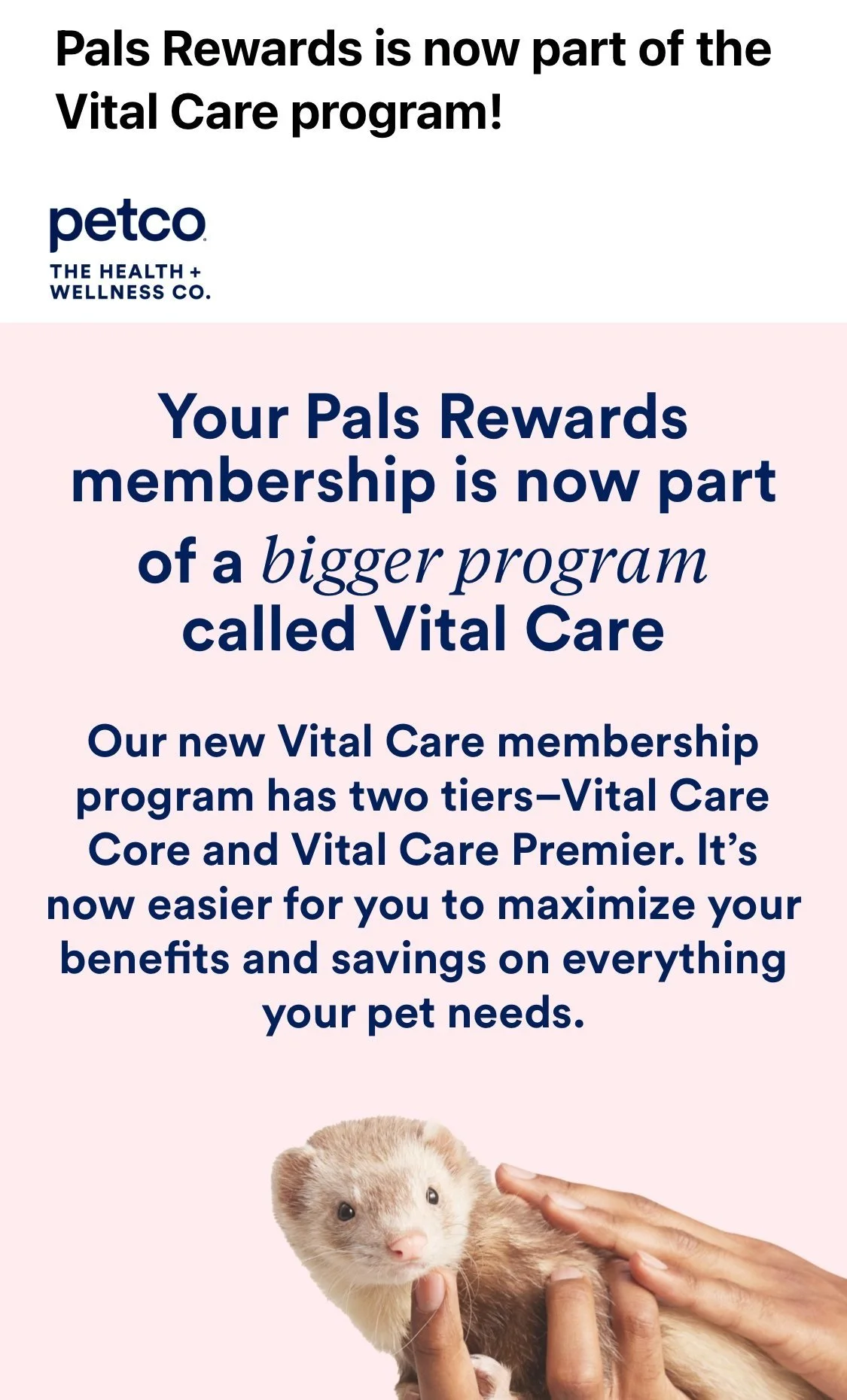
Update
Petco has now introduced all of our new feautures in their mobile app!
-
![]()
Petco has now a Rewards Program
-
![]()
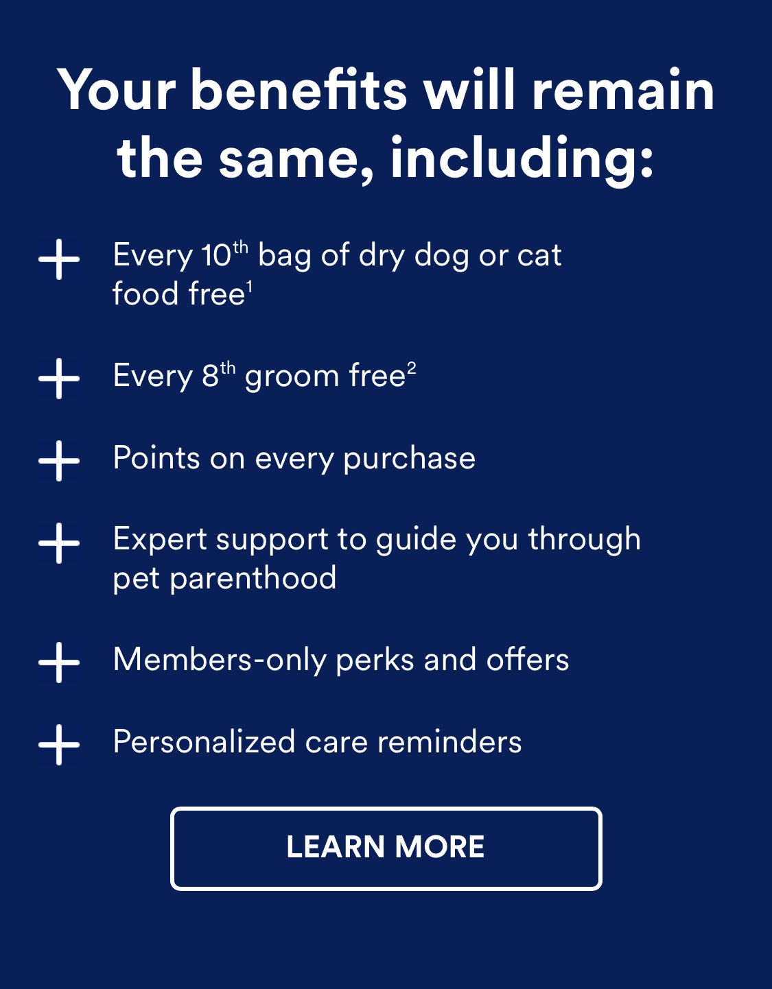
It offers free services
-
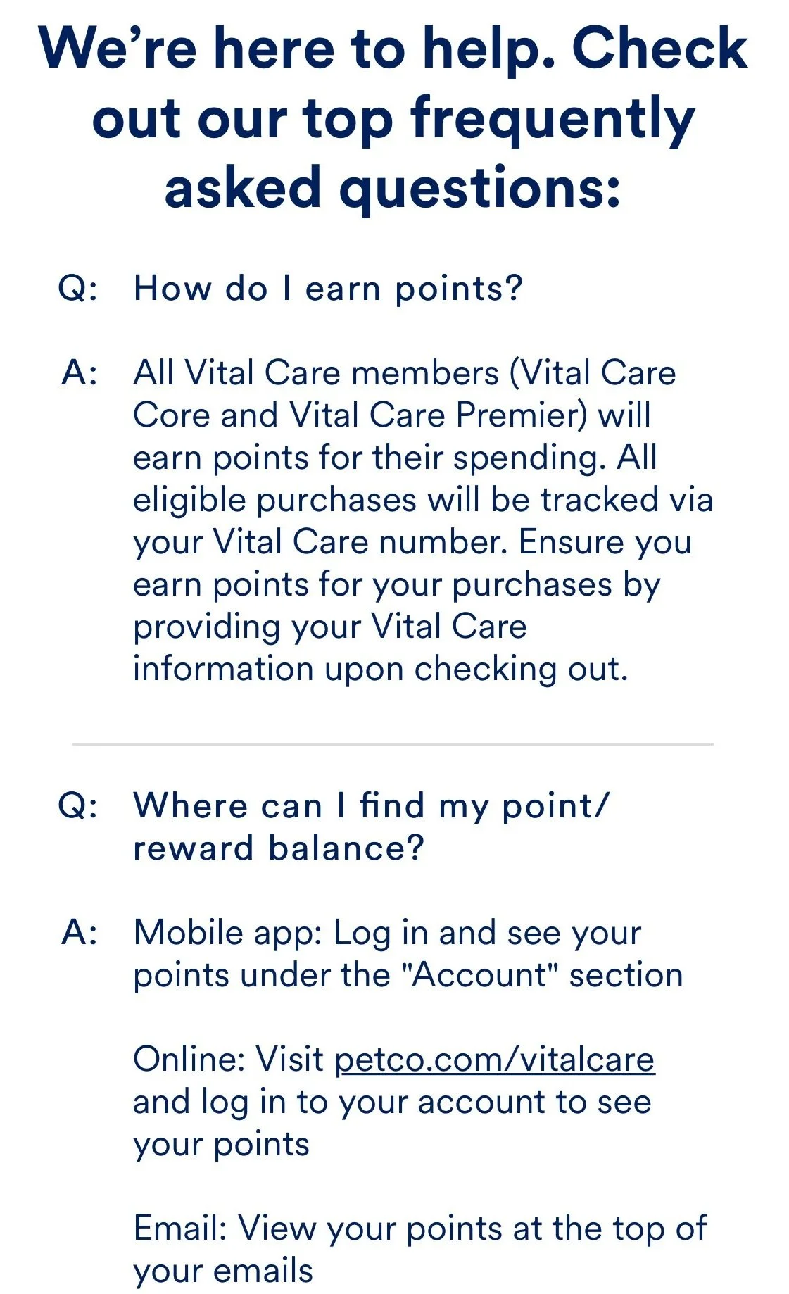
![]()
It helps users to save money