
Data Focused Mobile App
Client Project / Team of 5
Duration: 2 Weeks
My Role: Planning Lead
Client Vision: As an owner of a sneaker store, Silhouette, our client realized that sneakers were being sold on the market with very little price transparency, which shook the cultural value of sneakers. As a community focused business owner, our client wanted a mobile platform where people were able to find accurate data on their phones before making an investment. She wanted everyone in the community to have insights into the market with proven, trustworthy data and a place where everyone could connect.
We observed secondary research conducted by well-known sources.
In February 2021, research firm and investment bank Piper Sandler estimated the market was worth an eye-popping $10 billion — a $4 billion increase from 2019.
Ebay’s study found that one in five 35 to 44 year olds believed that sneakers were the most important item in their closet.
Knowing that this is a huge market with a great deal of potential, we needed to find out more about how users felt.
We conducted a survey which accrued 81 participants, mostly between the ages of 18 and 35. The majority of the participants were male.
The results showed that 82% of users thought sneakers defined someone’s character and personality.
91.4% of users bought and sold sneakers online.
And based on our research, 50 users chose StockX as their first choice for online buying and selling. Goat and Ebay, Facebook followed.
We looked at our competitors to see how they were tackling similar issues. We looked at two competitors, StockX and Sole Collector, who provide information on pricing of sneakers. Additionally, we conducted a comparative analysis with AirDNA and Moody’s- two platforms that provide data unrelated to sneakers but relevant to the experience. We compared some of the main features of these sites and took note.
My team and I also collected data for the need of an app like Arbit in the market by first a method called, Card Sorting where we collected all the answers to interview questions to then organize them by their common pain points in the Affinity Mapping process.
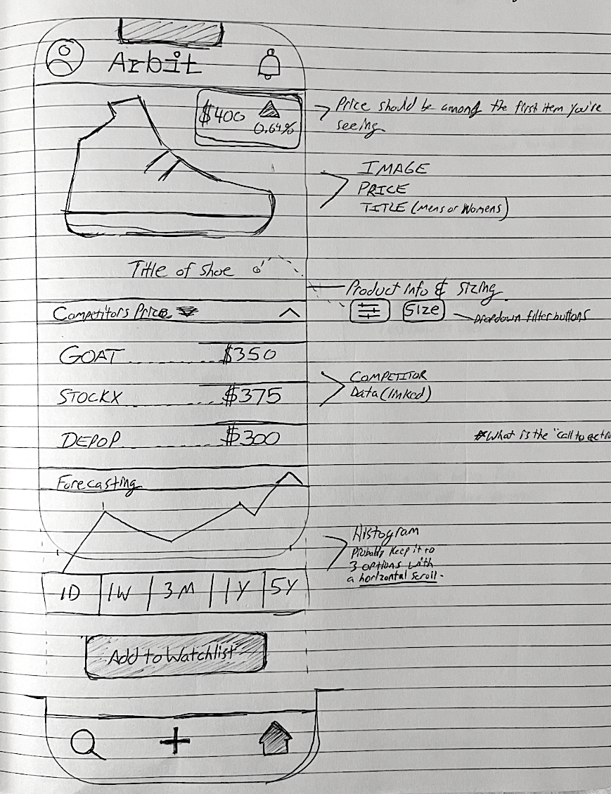
As a group of designers, we conducted a research method called, Task Analysis where we investigated how each app would go about completing a task that is common to all of them. In our case, the task was to track a shoe for the month of October, find its value, and to figure out if the price was increasing or decreasing.
Affinity Map
After conducting all of this research we could now move to the Define phase of our process, which includes a Persona Creation, Problem Statement and How Might We’s list, all of which helped us with defining the target users and the problem.
Target User 2
Target User 1
Arbit then connects our users
Next step was defining some tasks that our users would perform while on the app by creating User Flows.
Focusing on the needs of Dan and Alex, we defined the most likely scenarios in which users might experience Arbit.
Sketches & Brainstorming

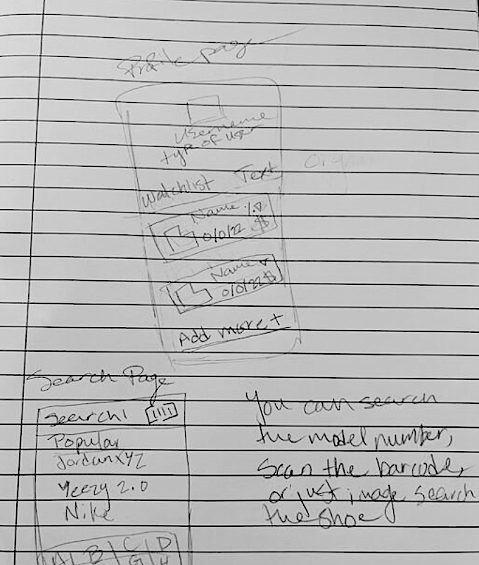
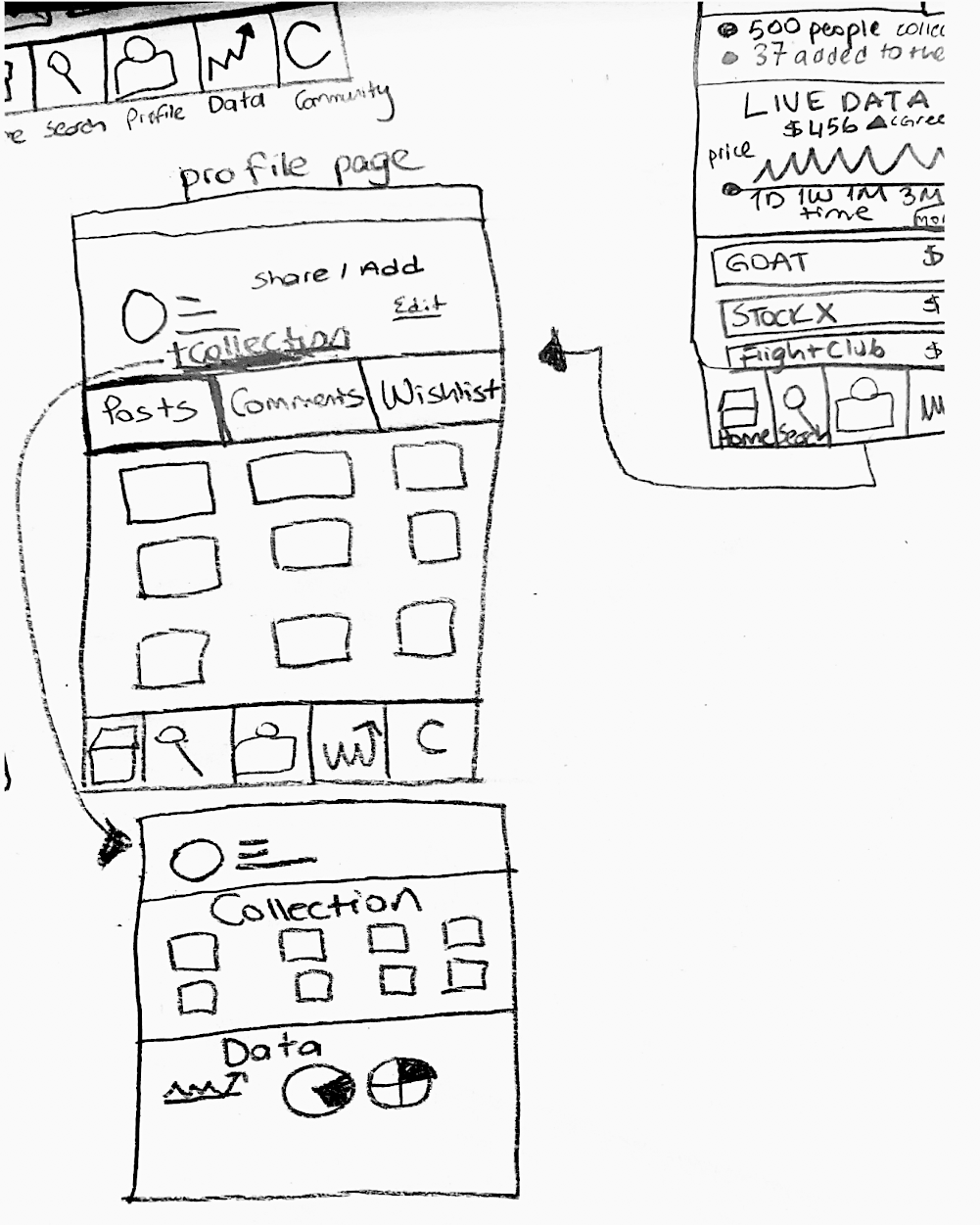
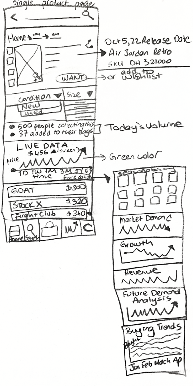
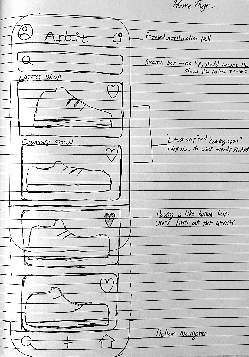
Low-fidelity Wireframes & Low-fidelity Prototype
After sketching and brainstorming for the app, as a team we contributed on the first digital drafts by transfering our sketches into a low fidelity prototype where we were able to combine the solutions to our users pain points as well as to our clients needs and goals for the app.
Next, we conducted a Usability Testing on our potential users to determine how our app could improve further.
During the initial Usability Testing Process, we have only used the Low Fidelity Prototypes, meaning the users were not able to see any colors or bright images, which initially enable them to focus on the functionality of the app only.
We performed usability testing on 13 users and we were happy to see that most users were able to perform the tasks we had defined, such as comparing two pairs.
We found that 92% of users were able to accomplish all tasks and 92% of users were able to add a pair of sneakers to their watchlist easily and quickly.
All users were able to scan a pair to check data on that certain pair.
Also, all users were able to view data for their collections, something that Dan would love to see!
However, 77% of our users questioned why notifications were under the fire sign instead of their own watchlist, or a combination of both.
It was also made clear to us by our client that the app should be more community oriented, rather than having comments section.
92% of our users had difficulty finding the scan button. They would not think the search icon would take them to scanning a pair of sneakers.
My team and I were successfully able to create Arbit from scratch thanks to all the research and our client’s vision for it. We were able to create the app with the following highlights.
Data driven mobile phone application
Platform for users to share insights
Ability to create a collection
Scanning options to shorten the time
Comparing data for two different products
Ability to create a watchlist and stay tuned
Next Steps for Arbit
We would like to incorporate the results from our second testing into the design and change the following before handing our design to developers.
Test hierarchy of information on Home screen with users
Add text to bottom navigation to clarify icons’ functions
Re-work the icon (notifications and camera) to make more clear
Adjust the Comparison button, to make more visible to users use
Arbit Hi-Fi Prototype Video